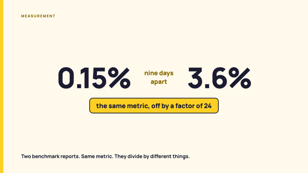
Two social media benchmark reports published nine days apart in January 2026 put the average Facebook engagement rate at 0.15% and at 3.6%. Both analyzed tens of millions of posts. Both are honest about their numbers. They disagree by a factor of 24 because they divide by different things, and neither figure survives being lifted out of its own report.
That gap is the whole problem with the question “how do we compare to the industry average?” This page traces where the most-quoted engagement figures come from, shows how they travel once they leave their methodology, and then sets out the baseline a practitioner builds from their own post history instead. The last section is the sentences you say to the person who asked.
The engagement rate you were handed has a publisher, a date and a sample you have not seen
A benchmark figure is a published number carrying four things: a publisher, a date, a sample frame and a metric definition. A number missing any of the four is not a benchmark. It is a decoration. Most figures quoted at practitioners arrive missing at least two.
Here is what the four attributes look like when they are all present. Socialinsider published its 2026 Social Media Benchmarks on 16 January 2026, written by Elena Cucu. The report’s own methodology section states the sample: 70 million posts from international brands active on TikTok, Instagram, Facebook and Twitter between January 2024 and December 2025. It states each metric definition too. Socialinsider divides reactions, comments and shares by a page’s follower count and multiplies by 100. Under that definition the report gives Facebook 0.15%, Instagram 0.48% and X 0.12%. (Socialinsider, 16 Jan 2026)
Buffer published 2026 Social Media Benchmarks You Can Use to Guide Your Strategy on 7 January 2026, written by Shea Karssing. Its at-a-glance table gives Facebook 3.6%, Instagram 4.3%, TikTok 4.86%, X 2.15% and LinkedIn 6.5%, all labeled median engagement rate. (Buffer, 7 Jan 2026)
Neither publisher did anything wrong. The two reports answer different questions, and the reader who quotes one figure at a client is usually not told which question was asked.
Socialinsider’s TikTok number shows how quickly the fourth attribute goes soft even inside one report. That same page carries the TikTok engagement rate as 2.60% in its executive summary, 2.70% in its quarterly section, 3.70% in its year-on-year table and 3.73% in the paragraph under that table. Four numbers, one platform, one page. A practitioner who screenshots the table and a practitioner who screenshots the summary now hold figures 42% apart and both believe they are quoting the same report.
The report also tells you, in a note at the foot of its methodology, that it contains 2025 values presented as 2026 because there was not enough 2026 data at publication. That note is the single most useful sentence on the page, and it is the sentence least likely to travel with the figure.
If you have been quoted a specific figure and you can name its source, the rest of this section and the next one are for you. If you have no figure yet and only need something to measure against, skip to the six-step method below.
What the methodology sections say, and why two reports cannot be averaged together
Buffer’s own methodology page states the formula plainly. In LinkedIn Leads in Engagement at 6.50%, published 7 April 2025 by Tamilore Oladipo, Buffer calculates engagement rate as total interactions divided by total impressions, multiplied by 100. The table on that page, headed average engagement rate, gives LinkedIn 6.50%, Facebook 5.07%, TikTok 4.86%, Threads 4.51%, YouTube 4.41%, Pinterest 3.46%, X 2.31% and Instagram 1.16%. (Buffer, 7 Apr 2025)
Impressions in the denominator, not followers. That single difference is most of the 0.15% against 3.6% Facebook gap. Buffer’s Facebook study makes the scale of the difference concrete: in What Is a Good Facebook Engagement Rate?, published 27 October 2025 from 52 million posts across 213,000 accounts, Buffer reports the typical Facebook account at 34 posts per month, a median engagement rate of 3.8% and a median reach per post of 365. (Buffer, 27 Oct 2025) For an account with 20,000 followers and a median reach of 365, the follower denominator is roughly 55 times larger than the impressions denominator. Divide the same engagement count by each and you get two numbers that look like different universes.
So averaging a follower-based figure with an impressions-based figure produces a percentage whose denominator does not exist. There is no arithmetic that rescues it. This is not a rounding disagreement between publishers, it is two different measurements sharing a name.
Fixing the denominator does not make the reports comparable either, which is the finding I did not expect to have to report.
Three vendors all publish LinkedIn engagement rates computed against impressions, and they do not agree:
- Buffer puts the LinkedIn median at 6.5%, from millions of posts, using interactions over impressions (Buffer, 7 Apr 2025).
- Taplio puts the LinkedIn average at 3.49%, from 219,456 posts, stating engagements divided by impressions times 100, and counting reactions, comments and replies, reposts, plus clicks on links, profiles and images and “see more” expansions (Taplio, 17 Jul 2026).
- AuthoredUp puts it at 2.86%, from 476,781 posts on personal profiles between March 2025 and February 2026, and says directly that most benchmarks report 5% to 6% because they use follower count as the denominator (AuthoredUp, published 3 Apr 2026, updated 5 Aug 2026).
Read those three together and the numerator turns out to matter as much as the denominator. Taplio counts the widest set of interactions of the three, including link and profile clicks, and still lands at roughly half of Buffer’s figure. A broader numerator producing a smaller rate means the two samples are not the same population of accounts. Buffer measures accounts publishing through Buffer. AuthoredUp measures personal profiles using AuthoredUp. Neither is a sample of LinkedIn.
The same publisher can disagree with itself across two live pages. Buffer’s The State of Social Media Engagement in 2026, published 5 March 2026 from more than 52 million posts, places LinkedIn at about 6.1% for 2025 and says it dipped from about 6.5% in 2024. A tier list further down that same page puts LinkedIn at about 6.2%. (Buffer, 5 Mar 2026) The 6.5% that the March page assigns to 2024 is the same 6.5% that the January page presents as the 2026 benchmark.
The platforms do not agree with each other either
Pinterest publishes its own definitions, and they show why cross-platform benchmark tables are built on sand. Pinterest’s analytics help page defines Engagements as saves, Pin clicks, outbound clicks, carousel card swipes and secondary creative clicks. Two rows later it defines Engagement rate as total engagements divided by the number of times Pins were seen, and lists the engagements as saves, Pin clicks and outbound clicks. Five components in the count, three in the rate, on one page from the platform itself. (Pinterest Business help, accessed 24 Aug 2026)
YouTube is blunter. The YouTube Analytics API metrics reference defines views as a core metric and then states that the metric represents different numbers in different types of reports. (YouTube Analytics API metrics, accessed 24 Aug 2026) When the platform tells you its own metric name is not stable across its own reports, a table averaging that metric across five platforms is not measuring anything.
Bluesky is the useful counter-case, because its definitions are published as a machine-readable specification. The AT Protocol lexicon app.bsky.feed.defs defines exactly five counters on a post view: likeCount, repostCount, replyCount, quoteCount and bookmarkCount. (AT Protocol lexicon, accessed 24 Aug 2026) There is no impressions field, so nobody can compute an impressions-based rate for a Bluesky account they do not own. Public data forces the follower denominator. That constraint is worth more than a flexible one, because it is written down.
How a figure survives without a source
A figure outlives its methodology because the methodology is the boring part. Follow one number forward instead of backward and you can watch it happen with dates attached.
Take the 6.5% LinkedIn figure. Buffer computed it on 7 April 2025 as an impressions-based average across a Buffer dataset, and headlined the article with it.
| Where the figure appears | Published | How that page states it |
|---|---|---|
| Buffer, LinkedIn Leads in Engagement at 6.50% | 7 Apr 2025 | Average engagement rate, interactions divided by impressions |
| Buffer, 2026 Social Media Benchmarks | 7 Jan 2026 | Median LinkedIn engagement rate, in a 2026 table, on a page whose own explainer tells the reader engagement rate divides by followers |
| alexberman.com, LinkedIn engagement rate | 28 Feb 2026, modified 19 Mar 2026 | Repeats Buffer’s sentence almost word for word, with no date range, and sets 6.5% as the “Platform Median” target in a calculator |
| shno.co, social media content performance statistics | no publication date on the page | Keeps the January 2024 to January 2025 window, and sits on a page with no date of its own |
| upvote.club, LinkedIn engagement rate | 16 Jun 2026 | Relabels it “its 2025 average engagement rate was 6.50%” |
| Buffer, The State of Social Media Engagement in 2026 | 5 Mar 2026 | Assigns about 6.5% to 2024 and gives 2025 as about 6.1% |
Four mechanisms are visible in that table, and each one is documented by a page you can open.
- A definition is replaced in transit. Buffer’s January 2026 page carries the impressions-based 6.5% under a heading that says median, on a page that separately tells the reader engagement rate is likes plus comments plus shares divided by followers. A reader who applies the on-page formula to their own account and compares against the on-page figure is comparing two incompatible quantities in good faith.
- The window falls off. The alexberman.com page reproduces Buffer’s claim without the January 2024 to January 2025 range that Buffer’s own January 2026 page states. The figure keeps its precision and loses its period.
- The label drifts to the current year. Buffer’s own March 2026 report assigns 6.5% to 2024. Three months later a third-party page calls it the 2025 average. Nobody lied. The year attached to a number is the least protected part of it.
- Roundups cite roundups. The shno.co page aggregates from Socialinsider, Buffer, Rival IQ, Emplifi, Hootsuite, Sprout Social and Statista, plus a page called “Dreamgrow Social Media Marketing Statistics 2025” which is itself a statistics roundup. The page states that it includes only figures published within the last two years and that every statistic is linked to its original study. The page carries no publication date and no machine-readable date of any kind, so the two-year claim cannot be checked.
Not every restatement loses information, and it would be dishonest to pretend otherwise. The shno.co page keeps the January 2024 to January 2025 window that two other pages drop. It also supplies a detail the original publisher’s own page does not.
That last case is worth its own paragraph, because it inverts the expected direction. Sprout Social’s Social media benchmarks by industry in 2025, published 5 May 2025 by Jasmine Williams, sources its figures to the 2025 Content Benchmarks Report and describes that report as an analysis of 3 billion messages across 1 million active public profiles (Sprout Social, 5 May 2025). Sprout’s own landing page for the report repeats the sample size and adds consumer surveys from the US, UK and Australia, but publishes no methodology section, no date range and no metric definitions (Sprout Social, report page, schema date 30 Apr 2025). The February 2024 to January 2025 window for that dataset appears on the undated aggregator page, not on either Sprout page I could read. The methodological detail travelled further than the publisher who owned it.
Two more mechanisms are worth naming because they are structural rather than careless.
Sprout’s blog page reports that average inbound engagements climbed from 70% in 2023 to 83%, and that average daily inbound engagements per post rose from 12 to 14. Percent signs on the first pair, bare counts on the second. A figure that carries the wrong unit on the publisher’s own page will carry the wrong unit everywhere it lands next.
Metricool’s Social Media Study 2026, published 10 December 2025 by David B., states its sample on the landing page: more than 39 million posts from over a million accounts. The report itself sits behind an email form, and the landing page publishes no figures at all (Metricool, 10 Dec 2025). The headline number travels free and the methodology travels gated. That asymmetry is a design decision, not a mistake, and it is why so many figures in circulation have no readable method behind them.
Even the machine-readable dates are soft. AuthoredUp’s page shows “Published: Apr 3rd, 2026, Updated: Aug 5th, 2026” in its byline, while its structured data gives a published date of 11 August 2026 and a modified date of 5 August 2026. The structured published date is six days after the structured modified date. Anything built on top of these dates inherits the inconsistency.
Build the baseline from your own history, in 6 steps
The number that answers “are we doing well?” is your own account’s prior distribution. It needs no vendor, no tool and no first-party access beyond what you already have. Six steps, in order.
- Pick one metric and write down the platform’s own definition of it, with a link, before you collect a single number. Paste the definition into the document where the baseline will live. If the platform publishes no definition for that metric, pick a different metric rather than guessing at the formula.
- Fix the window and the unit, then keep both constant forever. Choose a calendar month or a quarter, choose per post or per account per month, and write the choice down next to the definition. A baseline whose window moves is not a baseline.
- Pull every post in that window, not a sample. Your own account is small enough to count completely, and sampling your own history reintroduces the exact sampling problem that makes published tables incomparable. Record the collection date, because engagement counts on live posts keep moving.
- Report the distribution, not the mean. Publish the median, the 25th, 75th and 90th percentiles, and name the outliers separately instead of letting them move the average. The reason is statistical, not stylistic: the NIST/SEMATECH e-Handbook of Statistical Methods states that for skewed distributions the mean and the median differ, and the mean is pulled in the direction of the skew (NIST/SEMATECH, Measures of Location). Social engagement is skewed in every dataset I have looked at, which is why the mean flatters a bad month and hides a good one. Percentiles are defined through order statistics (NIST/SEMATECH, Percentiles), and an outlier is an observation lying an abnormal distance from the rest of the sample, which leaves the threshold to the analyst (NIST/SEMATECH, What are outliers in the data?). Set your threshold in writing and apply it the same way next quarter.
- Segment only where a segment holds enough posts to read. Split by the factors that actually move the number for this account: format, topic, day of week, paid against organic. When a segment holds five posts, report the five raw numbers and say so, rather than computing a percentile from them.
- Restate the baseline as a trailing comparison against the account’s own prior periods, and record what you did. Your report line compares this window’s median to the previous window’s median for the same metric under the same definition. Save the collection date, the definition link, the window, the unit and the segment rules in the same document, so next quarter’s number is auditable by somebody who is not you.
Where this holds and where it does not:
- It holds when the account has enough of its own history in the window for percentiles to mean something, and the platform did not change the metric definition mid-window.
- A brand-new account has no baseline yet. Report raw counts with the window stated, and say plainly that a baseline needs more history. Do not compute percentiles from eleven posts.
- A definition change mid-window breaks the comparison. If a platform changes how a metric is reported partway through your window, you cannot compare across that break. Split the window at the change date and start a new baseline after it.
- One viral post does not make a good month. Report the median and name the outlier separately, with its own number.
- A predominantly paid account is measuring spend response, not organic performance. Separate paid and organic history before any of this holds, or the baseline tracks the media plan.
The measurement questions this method leaves open, from platform-specific metric definitions to what a stakeholder report should actually contain, sit in the archive on what the numbers mean and what they hide.
The method run once, on a public account, with the numbers shown
I ran the six steps against a public account so the output is inspectable rather than described. Every number below belongs to one account.
The setup, in the order the steps require.
- Account: NPR, handle
npr.orgon Bluesky, DIDdid:plc:ln72v57ivz2g46uqf4xxqiuh. Followers at collection: 1,007,316. - Metric definition, from the platform’s specification: the AT Protocol lexicon
app.bsky.feed.defsdefineslikeCount,repostCount,replyCount,quoteCountandbookmarkCounton a post view. I summed likes, reposts, replies and quotes, excluded bookmarks, and divided by follower count times 100. - Window and unit: 1 July 2026 to 31 July 2026 UTC, per post.
- Population: all 762 top-level posts NPR published in that window. Reposts of other accounts and replies are excluded. This is the account’s complete history for the window, not a sample.
- Collection: the public Bluesky AppView API, endpoints
app.bsky.actor.getProfileandapp.bsky.feed.getAuthorFeed, collected 24 August 2026. Both endpoints are unauthenticated, so any reader can reproduce this without owning the account. - Percentile method: linear interpolation between order statistics.
NPR’s own July 2026 distribution on Bluesky. These are one account’s numbers over one month under one definition. They are not a comparison point for any other account, and if you use them as one you have recreated the problem this page is about.
| Statistic | Engagement rate per post | Engagements per post |
|---|---|---|
| 25th percentile | 0.0146% | 147 |
| Median | 0.0208% | 210 |
| 75th percentile | 0.0325% | 328 |
| 90th percentile | 0.0496% | 500 |
| Mean | 0.0286% | 288 |
| Highest single post | 0.9164% | 9,231 |
Total engagements across the 762 posts: 219,388.
Step 4 earns its place immediately. NPR’s mean engagement rate for July 2026 is 0.0286% and its median is 0.0208%. The mean is 37% higher, and only 242 of 762 posts reached it. A report built on the mean tells this account that 68% of its month underperformed, which is a statement about arithmetic rather than about the work.
One post drives most of that gap. On 17 July 2026 at 23:52 UTC, NPR posted a link about a federal court case over ICE access to Medicaid data. It took 5,686 likes, 3,155 reposts, 174 replies and 216 quotes, for 9,231 engagements and a 0.9164% engagement rate (post, collected 24 Aug 2026). That single post is 44 times the account’s median and 4.2% of the month’s total engagements. The top five posts together account for 8.7%. Name that post in the report, then set it aside. It says something real about one story and nothing about how July went.
Step 1 earns its place too, on a smaller scale. Bookmarks are the fifth counter in the lexicon and I excluded them. Including bookmarks moves NPR’s median from 0.0208% to 0.0214%, which is 2.9% higher. That is a small difference produced by one defensible decision about one field. Two analysts working from the same public API and the same account, both correct, would publish medians 2.9% apart. Now imagine that decision made twenty times across five platforms by four vendors, and the 24-fold Facebook gap at the top of this page stops looking like anyone’s error.
Step 5 earns its place by refusing to produce a finding. NPR published 757 of its 762 July posts with an external link attached and five without. The five non-link posts show a mean engagement rate of 0.0787%, which is nearly three times the account’s overall mean, and a reader would happily turn that into a rule about link penalties. Five posts cannot support a percentile, let alone a rule. The honest report line is that the segment held five posts and was not readable.
Step 6 is the only step that produces the sentence a stakeholder actually wants, and it needs two windows. The same collection covers 1 to 24 August 2026 completely, so here is the trailing comparison against the matching 24 days of July, same account, same definition, same unit:
- 1 to 24 July 2026: 603 posts, median engagement rate 0.0206%, median 208 engagements per post.
- 1 to 24 August 2026: 536 posts, median engagement rate 0.0209%, median 211 engagements per post.
NPR’s median held flat across those two windows while its post count fell by 11%. That is the whole output of the method: one number, one prior number, same definition, and a stated window. It took no vendor and no account access.
Note the two limits of this example, because they apply to your version of it as well. The follower count is a snapshot taken on the collection date, not the follower count at the moment each post was published, so the denominator is approximate for older posts. And Bluesky publishes no impressions to non-owners, so this is a follower-based rate and cannot be compared to any impressions-based figure. Both limits belong in the report next to the number.
What to say to the person who asked for the industry average
The person asking for an industry average wants to know whether performance moved. Give them that, and name what you compared.
Five sentences do the work. Using the worked example above as the shape:
> Across 1 to 24 August, the median post on this account drew 211 engagements, or 0.0209% of followers, against 0.0206% over the matching 24 days of July. Our median held flat while our post count fell 11%. We report the median rather than the average because one post on 17 July drew 9,231 engagements, 44 times our median, and it moves the July average by more than a third on its own. Engagements here means likes, reposts, replies and quotes divided by follower count, which is the platform’s published counter set and the only one visible without account access. We are not using a published industry average, because the two most-cited reports this January put the same platform’s average 24 times apart depending on whether they divide by followers or by impressions.
That last sentence is the one people expect to be a fight and it is not. Nobody argues with “these two reports disagree by 24 times, here is the link.” What they argue with is a comparison you cannot source.
Where an external comparison is genuinely owed, say a contract that promises competitive reporting, the honest form is a named-competitor comparison built from publicly visible metrics, with its limits written next to it. Public counters exist on some platforms and not others, they exclude everything the platform does not expose to non-owners, and they say nothing about reach. That comparison is a different piece of work with its own method, and it is not an industry average.
Why the same metric name means different things on different platforms
Pinterest’s engagement rate divides by times seen. Buffer’s divides by impressions. Socialinsider’s divides by followers. YouTube states that its own views metric returns different numbers in different reports. The same word maps to different formulas on different surfaces, and a single account’s numbers change meaning when they cross platforms. That is a bigger subject than this page and it deserves its own.
When a published benchmark report is still worth reading
A benchmark report is worth reading for its method, its segment definitions and its year-over-year direction. Buffer’s 2026 page carries three explicit caveats telling the reader that each study pulls from different companies, niches and posting volumes. Sprout Social’s page recommends that teams build personal benchmarks from their own year-over-year data. AuthoredUp explains exactly which denominator inflates the common figures. Read the methodology sections and the caveats, take the direction of travel, and leave the headline average where you found it.
Questions practitioners ask
Why do two reports give different average engagement rates for the same platform and the same year?
Two reports give different averages because they divide by different denominators and count different things in the numerator. Socialinsider divides reactions, comments and shares by follower count and reports Facebook at 0.15% for 2026. Buffer divides interactions by impressions and reports Facebook at 3.6% for 2026. Both are internally consistent. Sample frames differ as well: each vendor measures the accounts that use its product, which is not a sample of the platform. Check the denominator first, the numerator second, and the sample frame third, and most of the disagreement resolves into two reports answering two questions.
How many posts do I need before my own baseline means anything?
You need enough posts in the window that a median and a 75th percentile are not being set by two or three items. There is no threshold worth inventing here, and any specific minimum you have been quoted is somebody’s rule of thumb. Work the other way: compute the distribution, then look at how many posts sit between your 25th and 75th percentiles. If that band holds only a handful of posts, report raw counts with the window stated and say the baseline is not established yet. The 762-post example above is comfortable. A 12-post month is not, and reporting it as raw counts is the honest answer, not a failure.
Can I use a competitor’s public numbers as a comparison?
You can use a competitor’s publicly visible counts, with three limits stated next to them. Public counters only show what the platform exposes to non-owners, which usually means likes, comments, shares or reposts and nothing about reach or impressions. Follower counts you can see are snapshots, not the counts at the time each post was published. And a competitor’s posting volume, format mix and paid support are invisible to you, so a rate difference may be a media budget rather than a content difference. State all three next to the comparison, or the comparison misleads more than an industry average would.
What do I tell a client who insists on an industry average?
Tell the client which published averages exist for their platform, what each one divides by, and what happens when you apply each to their account. The two most-cited January 2026 reports put average Facebook engagement at 0.15% and 3.6%, and the gap is the denominator. Then give the client the comparison that does answer their question: this window’s median against the prior window’s median, same definition, same unit, with the outliers named. Most clients asking for an industry average are asking whether the work is going in the right direction, and a trailing comparison answers that with numbers you can both audit.
My platform changed how it reports a metric mid-quarter. Can I still compare?
You cannot compare across the break, and pretending otherwise is where most reporting quietly goes wrong. Split the window at the date the definition changed. Report the pre-change period and the post-change period separately, state the change date, and start the new baseline from the post-change period. If the platform published the change, link it in the report. If the platform did not publish it, say that the change is inferred from the data and that the pre-change comparison is unavailable, rather than presenting a single number that spans two definitions.