If your monthly report shows engagement down 18 percent, there are two possible explanations. The work got worse, or last month contained one post that did not repeat.
Distinguishing between those two is the whole job of a social media report, and most reports are built in a way that cannot do it. Here is the measurement that shows why.
Over the 90 days to 5 September 2026 I collected every post published by 60 public brand and publisher accounts on Bluesky, from the public API. For the 31 accounts that published at least 100 original posts, I added up likes, reposts, replies and quotes on every post and looked at how that total is distributed inside each account.
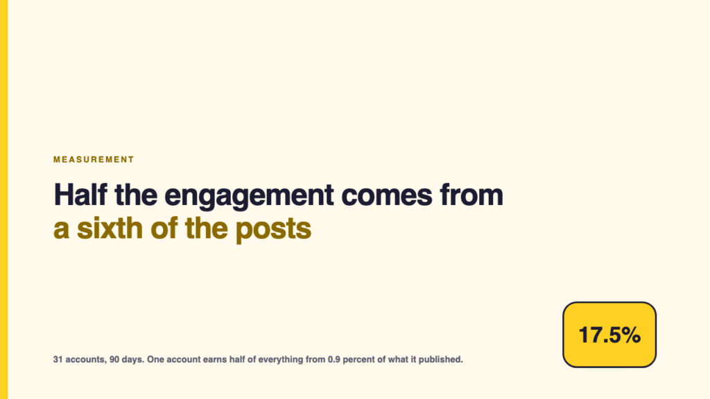
Across those 31 accounts, the median account gets 37.9 percent of its engagement from its best 10 percent of posts, and half of its engagement from its best 17.5 percent.
The concentration varies enormously, and the busiest accounts are the worst
| Account | Posts | Share of engagement from the top 10% of posts | Share of posts producing half of all engagement |
|---|---|---|---|
| The Verge | 1,753 | 78% | 0.9% |
| Rolling Stone | 635 | 64% | 3.0% |
| NBA | 585 | 57% | 6.3% |
| Netlify | 180 | 54% | 8.3% |
| Axios | 383 | 54% | 7.8% |
| Wired | 1,033 | 51% | 9.7% |
| TechCrunch | 1,452 | 48% | 11.6% |
| The Wall Street Journal | 2,465 | 48% | 11.5% |
| 404 Media | 449 | 46% | 12.5% |
| The New York Times | 2,279 | 46% | 12.5% |
| Reuters | 2,454 | 46% | 12.3% |
| Internet Archive | 123 | 42% | 15.4% |
| The New Yorker | 2,071 | 39% | 16.0% |
| Semafor | 1,420 | 39% | 17.2% |
| The Associated Press | 2,480 | 38% | 17.6% |
| The Atlantic | 2,375 | 38% | 17.3% |
| The Guardian | 2,495 | 37% | 17.5% |
| Bloomberg | 2,403 | 37% | 18.3% |
| Ars Technica | 1,221 | 37% | 19.7% |
| The Economist | 2,492 | 35% | 19.5% |
| Polygon | 2,500 | 32% | 22.3% |
| New Scientist | 2,355 | 32% | 22.1% |
| Vox | 505 | 31% | 23.0% |
| NPR | 2,204 | 31% | 23.5% |
| Nature | 786 | 31% | 22.3% |
| EFF | 540 | 28% | 24.6% |
| PlayStation | 121 | 28% | 26.4% |
| Engadget | 1,633 | 26% | 26.6% |
| IGN | 309 | 25% | 29.1% |
| Wikipedia | 150 | 24% | 32.0% |
| Crunchyroll | 204 | 19% | 34.3% |
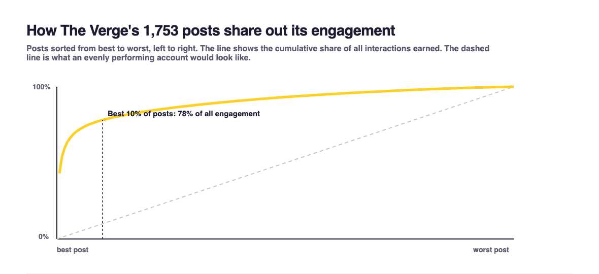
The Verge is the extreme case, and it is worth stating precisely. It published 1,753 posts in the window. Its best 1 percent of posts, about seventeen of them, carry 51.8 percent of everything the account earned. Its best 10 percent carry 78 percent. Half of its 90 day engagement comes from 0.9 percent of its posts.
At the other end, Crunchyroll’s best 10 percent carry 19 percent of its total and it takes a third of its posts to reach half. That is close to what an evenly performing account looks like, and only one account in this set is anywhere near it.
Six of the 31 accounts get half or more of their engagement from a tenth of their posts.
What this does to a monthly number
Remove the single best post from each account and recompute its mean engagement per post. Across the 31 accounts, the median account’s mean falls by 2.6 percent. That sounds harmless until you look at the accounts where it does not:
- Rolling Stone: removing one post of 635 drops the account’s mean engagement per post by 30.4 percent.
- Axios: one post of 383, 23.1 percent.
- TechCrunch: one post of 1,452, 14.1 percent.
- The Verge: one post of 1,753, 11.9 percent.
One post. Not a bad month, not an algorithm change, not a strategy failure. A single item, removed from a quarter of output, moving the headline number by up to thirty percent.
If your report says engagement per post rose or fell by twenty percent and your account looks anything like Rolling Stone’s, that number contains no information about the work at all. It tells you whether one thing happened.
The gap between the best post and the normal post
The reason this happens is visible in a single ratio. On The Verge’s account, the best post earned 29,819 interactions and the median post earned 31. That is a factor of nearly a thousand. Rolling Stone: 27,742 against 45. TechCrunch: 6,229 against 17.
Those accounts are not producing a stream of similar things with some variation. They are producing a large number of small results and a very small number of enormous ones, and any summary statistic that mixes the two will be dominated by whichever enormous ones happened to land in the reporting period.
What to report instead
- Report the median, and report the count of posts above a threshold you set once. “Median interactions per post” plus “posts above 500 interactions” describes both the normal work and the hits, and neither number swings on a single item.
- Show the distribution once a quarter. A simple sorted bar of every post’s engagement makes the shape obvious to a stakeholder in a way no summary can, and it inoculates them against the next month-on-month swing.
- Name the outlier explicitly in the report. If one post carried the month, say so and link it. That is the most useful sentence on the page and it stops the number being misread as a trend.
- When you compare periods, compare like for like. Same definition, same denominator, and if one period contains an outlier that the other does not, say which.
- Do not chase the outlier. Nothing here says the big posts are reproducible. The accounts with the highest concentration are not the ones with the best results per post; The Verge’s median post earns 31 interactions.
What this cannot tell you
- One platform, 90 days, one collection date, 31 accounts weighted towards news and technology publishers. Publishers post far more than most brands, and post volume is part of what produces this shape.
- Engagement here is likes, reposts, replies and quotes on the account’s own posts. Replies by the account are excluded. Impressions are not available on this platform, so none of this is a reach measurement.
- Nine of the highest volume accounts hit the collection page cap of 2,500 posts, so their windows are shorter than 90 days. Concentration is a within-account proportion and is not distorted by that, but the post counts shown are floors.
- Counts move. Everything here is as read on 5 September 2026, and recent posts in the window have had less time to accumulate than older ones, which if anything understates concentration.
Source ledger
- Post records: the public Bluesky AppView API (
public.api.bsky.app), endpointsapp.bsky.actor.getProfileandapp.bsky.feed.getAuthorFeed, read without authentication on 5 September 2026. 60 accounts, 45,026 posts; this piece uses the 31 accounts with at least 100 original posts in the window. - The definitional problem that sits underneath this one, five common ways to calculate an engagement rate and the four different winners they produce, is Five ways to say engagement rate.