A designer sends over a quote card: light text across a photograph. The manager looking at it is asked whether it is accessible, and the usual answer is “it needs 4.5 to 1”. That number is real, but it is only half of what the standard says about text.
The question a sign-off actually asks
This post narrows “accessible” to one thing, the contrast of text against what sits behind it. The document being read is WCAG 2.2, a W3C Recommendation dated 12 December 2024, along with the Understanding pages for Success Criteria 1.4.3, 1.4.6 and 1.4.11 and the failure technique F83. All of it was fetched on 5 October 2026.
This is a reading, not a test. No graphic was measured and nobody was interviewed. Two labels are used throughout. What the standard says marks text quoted or closely paraphrased from W3C material. My reading for a social graphic marks interpretation, which is not the standard’s text and which a careful person could dispute.
One more thing about sourcing. The Understanding pages carry the W3C’s own line “Updated 06 September 2026” and, at the top of each page, the label “Informative explanations, not required to meet WCAG”. The Recommendation is the normative text.
What 1.4.3 requires, and the size rule that splits it
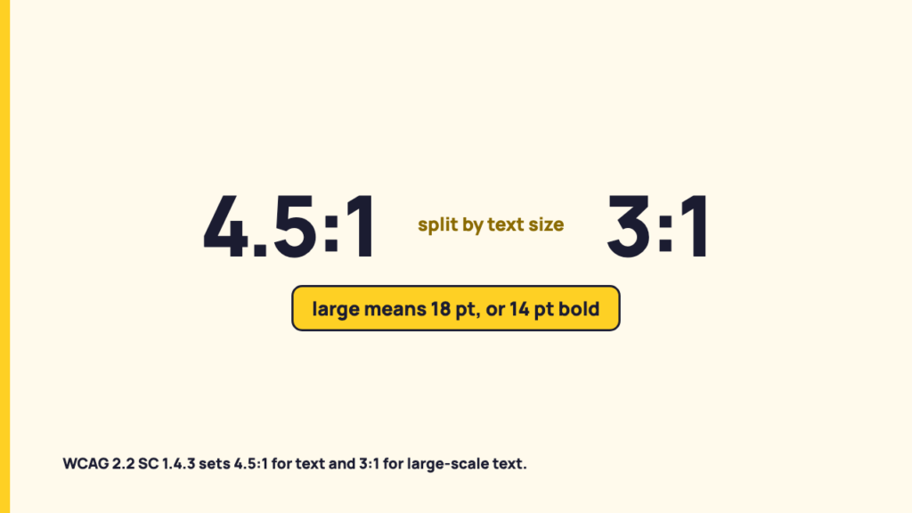
What the standard says. SC 1.4.3 Contrast (Minimum), Level AA, reads: “The visual presentation of text and images of text has a contrast ratio of at least 4.5:1, except for the following.” The first exception is Large Text: “Large-scale text and images of large-scale text have a contrast ratio of at least 3:1.” Two thresholds sit inside one criterion, split by text size.
The glossary defines large scale text as “at least 18 point or 14 point bold or font size that would yield equivalent size for Chinese, Japanese and Korean (CJK) fonts”. Note 1: “Fonts with extraordinarily thin strokes or unusual features and characteristics that reduce the familiarity of their letter forms are harder to read, especially at lower contrast levels.” Note 2: “Font size is the size when the content is delivered.”
The Understanding page adds that 18 point and 14 point bold are “general measures”, and that “18 point” and “bold” can both have different meanings in different fonts. The glossary’s note on points versus pixels is the standard’s, and this post does not convert anything. The size that counts is the size in points as delivered, which the designer has to state.
The glossary defines the ratio as (L1 + 0.05) / (L2 + 0.05), where L1 is the relative luminance of the lighter of the colours and L2 is the relative luminance of the darker. Note 1 says ratios run from 1:1 to 21:1. No example pair is worked here.
The exceptions written into the criterion
What the standard says. The criterion lists two further exceptions, Incidental and Logotypes. Both state “no contrast requirement”. The table sets each wording beside what the Understanding page says.
| Exception | The criterion’s wording | What Understanding 1.4.3 says |
|---|---|---|
| Inactive component | Text or images of text “that are part of an inactive user interface component” | Inactive components are those not available for user interaction, such as a disabled control. The page illustrates the case with a grey button carrying non-contrasting grey text. |
| Pure decoration | Text or images of text “that are pure decoration” | Text that is decorative and conveys no information is excluded. The example given is random words used as a background that could be rearranged or substituted without changing meaning. |
| Not visible to anyone | Text or images of text “that are not visible to anyone” | Covers text “designed to be invisible or hard to discern to all viewers”. |
| Part of a picture with significant other visual content | Text or images of text “that are part of a picture that contains significant other visual content” | Meant “to separate pictures that have text in them from images of text that are done to replace text in order to get a particular look”. The page’s example is a person’s name on a nametag in a photograph. Its other example is a street sign that a photograph happens to include. |
| Logotypes | “Text that is part of a logo or brand name” | “Beyond logos and logotypes, text that has insufficient contrast due to corporate identity or brand guidelines is not exempted from the requirements of this criterion.” |
The last row matters most. A brand palette is the common defence of pale text, and the Understanding page closes that door for anything that is not a logo or brand name.
Where 4.5:1 stops being the whole story: 1.4.6 and 1.4.11
What the standard says. SC 1.4.6 Contrast (Enhanced), Level AAA, asks for a ratio of at least 7:1, with large-scale text at least 4.5:1, and carries the same incidental and logotype exceptions. Conformance section 5.2.1 says, in a note: “It is not recommended that Level AAA conformance be required as a general policy for entire sites because it is not possible to satisfy all Level AAA success criteria for some content.”
SC 1.4.11 Non-text Contrast, Level AA, asks for at least 3:1 “against adjacent color(s)”. It covers user interface components and states, and graphical objects, defined as “parts of graphics required to understand the content, except when a particular presentation of graphics is essential to the information being conveyed”.
An honest note. 1.4.11 is about non-text information: controls, icons, parts of a chart. It is not about text. Text stays with 1.4.3 and 1.4.6. The numbers 4.5, 3 and 7 get blurred together, though Understanding 1.4.11 does say its requirements and rationale are “similar to those for large text in 1.4.3”.
That page also tells testers: “If there are multiple colors and/or a gradient, choose the least contrasting area to test.” That instruction belongs to graphical objects. By the standard’s own words it does not transfer to text.
What the standard does and does not say about text over a photograph
What the standard says. The contrast ratio definition has the relevant notes. Note 3: “For the purpose of Success Criteria 1.4.3 and 1.4.6, contrast is measured with respect to the specified background over which the text is rendered in normal usage.” Note 4 says background color is “the specified color of content over which the text is to be rendered in normal usage”, and calls it a failure to specify text color without background color, or the reverse.
Note 5 deals with outlines. A narrow border around a letter “would be used as the letter”, while a wide border that fills in the inner details of the letters “acts as a halo and would be considered background”.
Understanding 1.4.3 lists technique F83 as a failure of 1.4.3 and 1.4.6: using background images that do not provide sufficient contrast with foreground text (or images of text). The technique pages are likewise not required to meet WCAG. Its description says that for pictures, “there would need to be sufficient contrast between the text and those parts of the image that are most like the text and behind the text.”
What was not found. The Understanding 1.4.3 page gives no worked rule for sampling the lightest or darkest region of a photograph behind text. F83 points toward the parts of the image most like the text, a direction rather than a procedure. How to measure a photograph with varying tones is not settled by the standard’s text as fetched, and that gap is where interpretation begins.
My reading for a social graphic
Everything in this section is interpretation. The first uncertainty is scope. WCAG was written for web content, and Section 5.2.2 says conformance “is for full web page(s) only”. A graphic posted to a platform is an image whose own conformance status the standard does not directly address. The platform’s interface is a separate matter, and this post makes no claim about it.
My reading, a quote card. A quote card is an image of text where the text was placed in the image to carry the message. The “significant other visual content” exception was written for text that happens to appear in a picture, the nametag and the street sign. The Understanding page sets those against “images of text that are done to replace text in order to get a particular look”. A quote card looks closer to the second case. The standard does not name social graphics, and reasonable people could read it differently.
My reading, a carousel slide. Where text is the content, 1.4.3 thresholds apply. The large-scale 3:1 threshold applies only if the delivered size meets the glossary definition, and a slide’s point size is not something to assume.
My reading, brand elements. A logo or brand name on a slide falls under the logotype exception. A tagline in brand colours does not, given the Understanding note on brand guidelines.
A decision sequence for a manager:
- Is the text part of the message, or incidental to a picture? The categories are the standard’s text. Where a quote card falls is my reading.
- Is it a logo or brand name? The exception is the standard’s text. Treating a tagline as outside it is the standard’s text via the Understanding page.
- Is it large-scale by the glossary definition, at least 18 point or 14 point bold as delivered? The definition is the standard’s text. Finding the delivered size is a question for whoever built the graphic.
- Which threshold follows? 4.5:1, or 3:1 if step 3 says large-scale. That is the standard’s text.
- What does a photographic background do to that? F83 describes failure when parts of the image behind the text are too like the text. That is informative technique text. How to measure it across a varying photo is my reading, because the standard does not settle it.
No law, regulation or platform policy is claimed to require this of a social post.
What to say when asked “is it accessible?”
The standard sets a threshold by text size and names its exceptions. Whether a photo-backed graphic passes depends on a measurement this post has not made and that the standard does not fully specify for varying backgrounds. “It meets contrast” is not a claim to make by eye.
Contrast is also one question among several. Alt text for the image itself covers the non-visual alternative for an image of text, and what the accessibility documentation says about video captions covers the other half for moving images.
What is fair to ask the designer for: the delivered text size in points for each line, the font and weight, and the two colours behind and in front of each line, including whichever part of the photo sits directly behind it.
FAQ
Does WCAG say 4.5:1 for all text?
No. SC 1.4.3 sets 4.5:1 with a lower 3:1 for large-scale text, which the glossary defines as at least 18 point or 14 point bold. The enhanced Level AAA criterion, 1.4.6, asks for 7:1, and 4.5:1 for large-scale text.
Does WCAG legally apply to social media posts?
This post makes no legal claim. The standard defines conformance for web pages, so applying it to an image hosted on a platform is interpretation, and that is how this post treats it.
Sources
- Web Content Accessibility Guidelines (WCAG) 2.2, W3C Recommendation, 12 December 2024, fetched 5 October 2026
- Understanding SC 1.4.3 Contrast (Minimum), fetched 5 October 2026
- Understanding SC 1.4.6 Contrast (Enhanced), fetched 5 October 2026
- Understanding SC 1.4.11 Non-text Contrast, fetched 5 October 2026
- Technique F83, fetched 5 October 2026