A video underperforms, you open the audience retention report, and there it is: a cliff in the first few seconds, then a slow bleed for the rest of the runtime. The instinct is to name a cause on the spot, a bad thumbnail, a slow intro, the algorithm suppressing the video. The curve alone cannot tell you which of those is real. It is one report, built from one definition of “still watching,” and it answers a narrower question than the shape suggests. Everything below traces to YouTube’s own published documentation of what the retention report measures, not to any video, dip, or result observed for this piece. There is no test behind it and no practitioner quoted, just the platform’s own words, read closely enough to know what they do and do not support.
A cliff at four seconds, and a decision to make
A video goes up, the numbers come in lower than the channel’s usual range, and the retention graph shows a sharp early drop before the line settles into a longer decline. Something has to be decided: change the hook, change the thumbnail, blame timing, or write it off as an outlier. It is tempting to read the curve as a verdict. It is not one. A drop at four seconds is consistent with several explanations at once, a mismatched thumbnail, a slow opening line, a title that promised something the video does not deliver in the first breath, or simply viewers clicking out of curiosity rather than intent. The curve cannot rank these for you. What it can do is tell you where in the video attention changed and let you compare that change across the audience slices YouTube actually documents. That is a narrower job than “explain the dip,” and it is worth doing well rather than skipping past it toward a guess dressed up as an insight.
What the audience retention report is actually built from
YouTube Studio shows two layers here, not one. The base retention curve is a line: the percentage of the audience still watching at each point in the video, over the whole timeline. On top of it, YouTube adds an automatic overlay it calls key moments for audience retention, segmenting the curve into four labeled categories. Per YouTube’s own support documentation, an Intro is defined as “what percentage of your audience still watched your video after the first 30 seconds.” Top moments are “moments in your video where almost no one dropped off while watching.” Spikes are “moments in your video that were rewatched or shared.” Dips “highlight moments in your video that were either skipped or moments where viewers stopped watching your video completely” (support.google.com/youtube/answer/9314415, fetched September 8, 2026).
That overlay does not appear for every upload. The same documentation states the floor plainly: “Your video should also be at least 60 seconds long and have at least 100 views.” Below that threshold, the Intro, Top moments, Spikes, and Dips labels simply are not generated. This floor governs whether the automatic labeling runs, not whether a retention curve exists at all. Any video with enough views to report on has a base curve; it is the named-moment overlay that needs the 60 second and 100 view minimum to switch on.
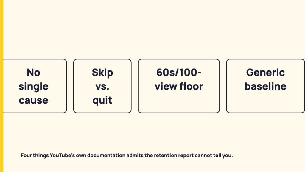
Four things this report cannot tell you
- It does not name a single cause. YouTube’s own wording for Spikes says they “can mean: Your audience watched that segment more than previous segments. Your content isn’t clear and your audience had to rewatch a section.” Two candidate explanations sit inside the platform’s own definition of one event on the curve. Dips get the same treatment: the documentation says a dip “can mean that your audience watched that segment less than previous segments” and recommends you “review your dips to better understand why,” an instruction to investigate further, not a diagnosis handed to you.
- It cannot separate a skip from a quit. YouTube defines a Dip as a moment “that were either skipped or moments where viewers stopped watching your video completely.” Those are two different viewer behaviors, one a scrub forward by someone who kept watching, the other an exit, and the documentation folds both into the same label and the same shape on the curve. A dip that recovers a few seconds later and a dip that bleeds into a dead stop can look identical.
- Below the stated floor, the overlay never runs. The 60 second and 100 view minimum means a meaningful share of ordinary uploads, particularly newer channels and low-view videos, never get an Intro, Top moments, Spikes, or Dips label at all, regardless of what shape their underlying curve has. No overlay does not mean no problem; it means the labeling tool was not eligible to run on that video.
- The comparison line is not built for your specific audience. The “typical retention” line is benchmarked against similar-length videos, either the channel’s own recent uploads or, through the report’s own expanded SEE MORE comparison, a broader set across YouTube. It is not built from that channel’s specific genre, niche, or usual audience composition. A curve sitting below the line is a difference from a general baseline, not an automatic failure grade.
Reading the four-second cliff without inventing a cause
The one comparison the documentation actually confirms you can run is a segment breakdown. The audience retention segments report lets you split the same curve by new viewers versus returning viewers, subscribers versus non-subscribers, and, if the channel runs ads, organic traffic versus paid traffic (same source, support.google.com/youtube/answer/9314415). This is where the four-second cliff stops being a single mystery and becomes a smaller set of live possibilities.
The same shape reads differently depending on where it shows up. A cliff that appears only in the paid-traffic segment points toward the ad creative or targeting bringing in viewers who were never the intended audience, since organic viewers arrived with more context. A cliff that shows up identically across every segment, new and returning, subscriber and not, organic and paid, points somewhere more structural: the opening seconds of the video itself, regardless of who is watching or how they got there. Neither of these is a confirmed finding here; no specific video’s segments were pulled for this piece. The segment comparison narrows which explanations are still standing, rather than asking the base curve to answer a question it was never built to answer alone.
One explanation worth ruling out explicitly: posting time, posting cadence, or any best-time-to-post theory. That question belongs to a different kind of analysis entirely, tied to when an audience is online rather than to what happens once someone has already clicked play, and it has no bearing on a drop that happens four seconds into a video someone is already watching.
Retention and views are not measuring the same event
A “view” is not the same event the retention curve is tracking. YouTube’s support documentation on how engagement metrics are counted states that “beginning August 24, 2026, views are counted the moment a video starts to play across all formats, including Shorts, long-form videos (VOD), and live streams” (support.google.com/youtube/answer/2991785, fetched September 8, 2026).
The consequence is direct. A view gets logged the instant playback begins, before the four-second mark a retention cliff describes. A view count that looks healthy, or is still climbing, tells you nothing about whether viewers stuck around past the opening seconds. The two numbers report on different moments in the same session, and a rising view count is not evidence against an early cliff being real, because the view was already counted before the cliff had a chance to happen.
What the documentation actually supports, and what it doesn’t
| The report can answer | The report cannot answer |
|---|---|
| Where in the video attention rose or dropped, as a shape over time | The single definitive reason a given dip happened |
| Whether one audience segment, new vs returning, subscriber vs not, organic vs paid, differs from another on the same curve | Whether a dip was viewers scrubbing forward while still watching, or viewers quitting outright |
| Whether this video’s curve differs from the creator’s own recent typical, or from a broader YouTube comparison | Anything about a video that falls below the platform’s own 60 second / 100 view floor for the key-moments overlay |
| Separately, in the Engagement tab, the video’s watch time and average view duration (support.google.com/youtube/answer/9002587) | Whether sitting below the “typical retention” line reflects a genre-specific or audience-specific problem, since that line is not built from your specific niche |
Reading a report against its own documentation instead of folklore is the same discipline applied to what a view actually counts as, per the platform documentation and, more generally, how to read a platform report without being fooled. The view-counting change dated August 24, 2026 cited above is exactly the kind of update that matters to a reporting routine built on these numbers, argued at greater length in why a documented metric change like this one matters to your reporting.
Reading the report as an instrument, not a verdict
The honest use of the audience retention report is narrowing the field of candidate explanations, not delivering one. It tells you where on the timeline something changed and gives you a small, documented set of ways to slice that change by audience segment. It does not tell you why, in the sense of a single confirmed cause, and it does not distinguish a viewer who scrubbed forward from one who left for good. Treating a single dip as a verdict is exactly the move the documentation itself never claims to support. The graph is a starting point for a smaller set of questions, not an answer to the one you actually asked.
FAQ
What is the difference between the retention graph and the key moments report on YouTube?
The base curve is the raw line showing the percentage of viewers still watching at each point in the video. Key moments, made up of Intro, Top moments, Spikes, and Dips, is an automatic overlay YouTube applies on top of that same curve, and per its own documentation it only activates for videos at least 60 seconds long with at least 100 views.
Why does my retention graph show a steep drop in the first few seconds?
YouTube’s own documentation lists more than one thing a dip “can mean” rather than naming a single cause, so the graph does not diagnose it for you. Comparing the same dip across the platform’s documented audience segments, new versus returning, subscriber versus not, organic versus paid, narrows the field of plausible explanations instead of leaving you to guess from the shape alone.
Sources
- Measure key moments for audience retention, YouTube Help, fetched September 8, 2026
- How engagement metrics are counted, YouTube Help, fetched September 8, 2026
- Learn the basics of YouTube Analytics, YouTube Help, fetched September 8, 2026